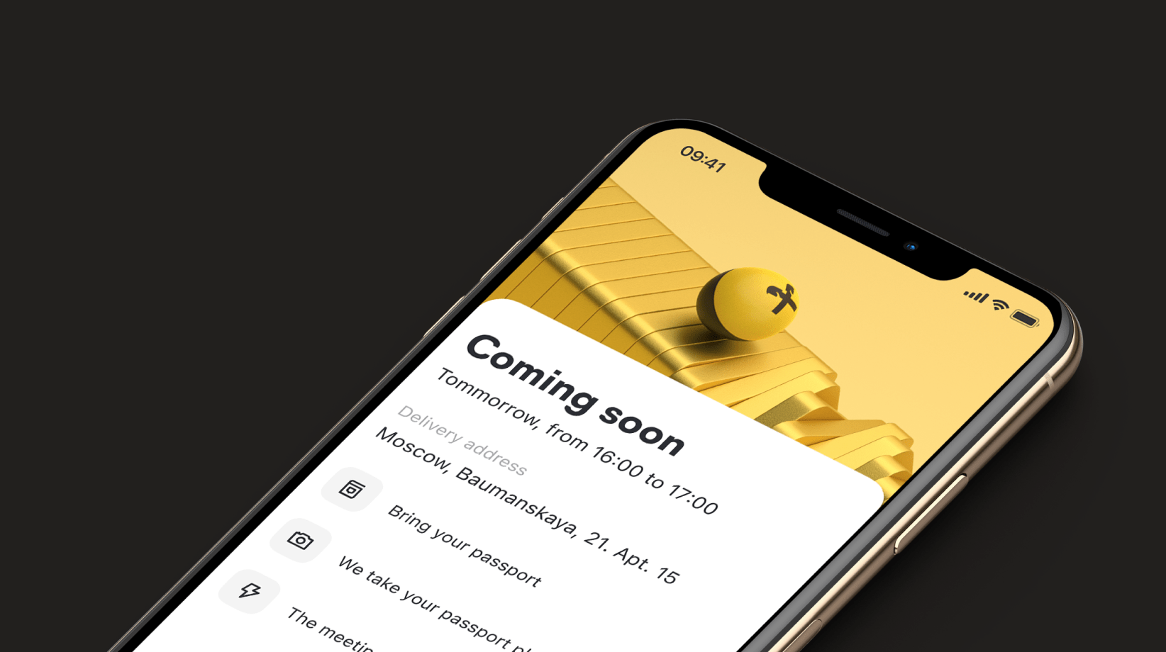
The card delivery status is a part of the “new to bank” clients’ journey in the Raiffeisen bank mobile application.
2021 — 2022


SEPHORA is a French multinational retailer of personal care and beauty products. The ILE DE BEAUTE store is a part of SEPHORA and has been the Russian perfume and beauty market leader for more than ten years. ILE DE BEAUTE was the first beauty retailer to launch a mobile online store in Russia.
From 2015 to 2020, I had an opportunity to be a part of the creation of two large e-commerce apps for the Russian market — Sephora and Ile de Beaute. I was involved in a whole app development process: ideation, wireframing, prototyping, designing for both mobile platforms and working hand in hand with developers and also presenting work to a client.


Through innovative meters systems, which can transfer data to smartphones, the My Home users keep their apartments and houses under control. Furthermore, monitoring water, heat, electricity, and gas might decrease their expenses.
Using the askthecrowd.app, we did quantitative research to understand how people in Russia are used to managing their bills and what they know about how to calculate the price of consumed energy. Based on the results, we created user scenarios and a detailed prototype.
Users can get quick access to information about their houses on the home screen. The screen is fully customized, so users are free to pick whatever statistic or cameras they want to see.
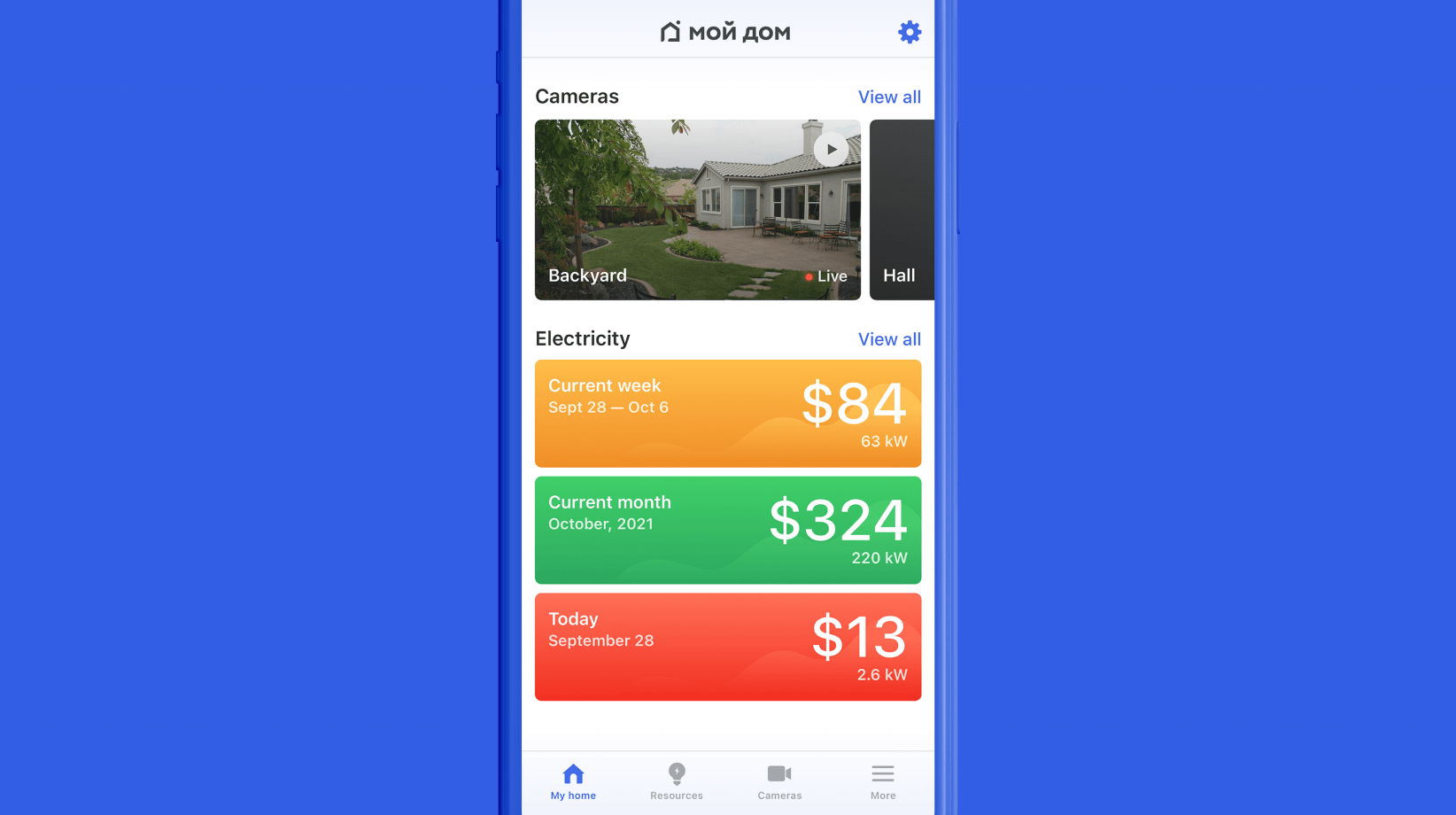
On the resources screen, users can track how much electricity they spend during different periods.
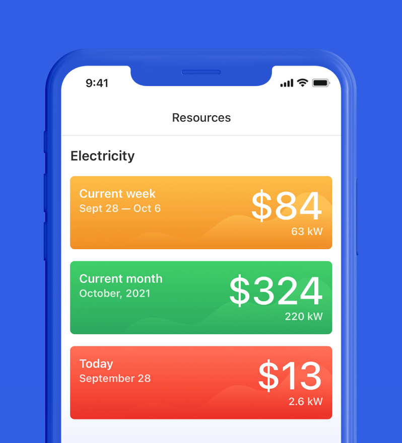
To track resource usage more accurately and save money — users can set a month's spending goal. We've used simple colour coding to help them understand whether they succeed in achieving their goals. Green — you are doing great. Yellow — you can do it better. Red — oh, it's time to reconsider your electricity usage.
To help our users achieve their saving goals, we've come up with the idea of using helpful tips. By analyzing where users could save more money, we offer them valuable solutions. E.g. if the system understands that the user uses a washer and a dryer in the afternoon or morning — we suggest using it at night 'cause it's cheaper.
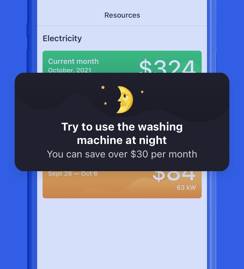
It's three different time zones with different electricity usage costs during the day in Russia. Afternoon — the most expensive, morning — with average price and night — the cheapest one.
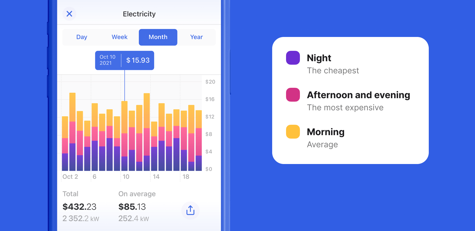
Using charts with different colour codes, the My Home users might compare electricity usage levels in different periods. It helps them to understand when they spend the most.
It is so important to keep the user experience uninterrupted. Therefore on every empty screen, users can find a way out.
In the end, our team made two applications, one for iOS and one for Android.Unfortunately, due to the technical causes with the client's hardware, the project was frozen and is not working.